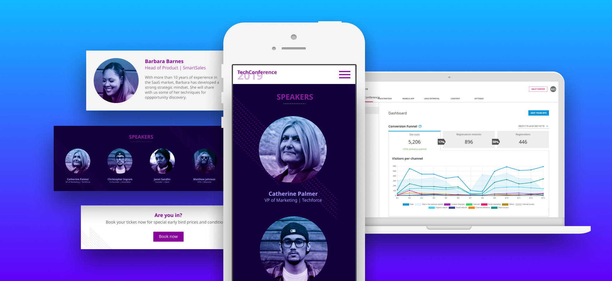
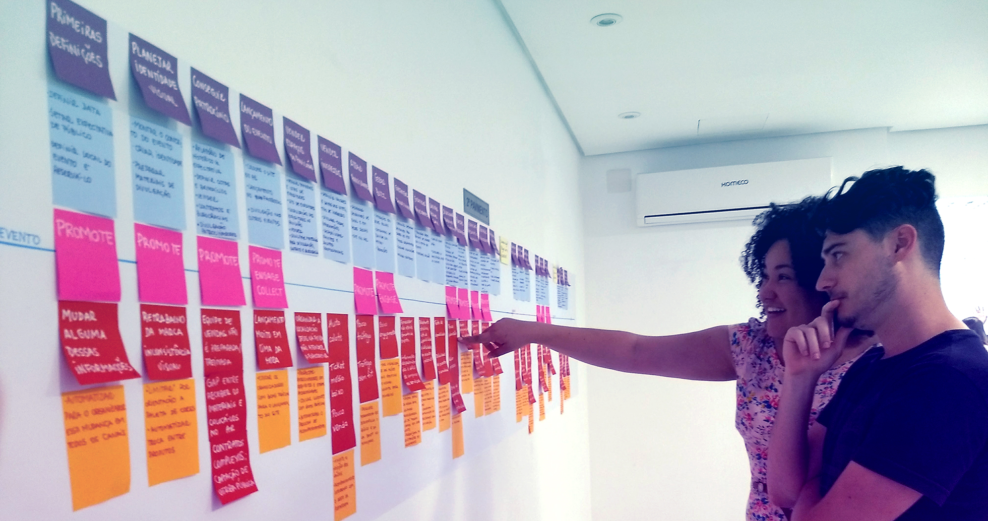
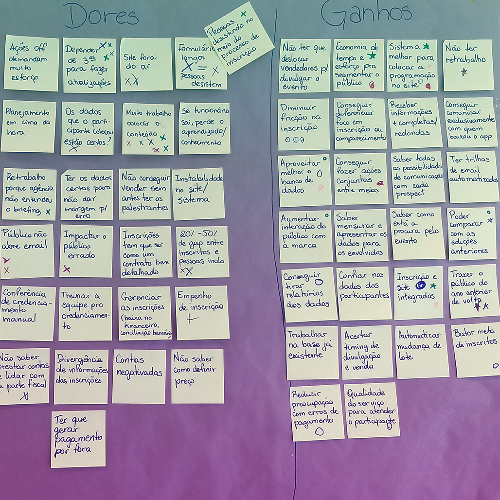
Event website builder and analytics

How can event organizers easily build a website focused on ticket sales and have actionable insights about their promotion efforts?

I was Lead Product Designer at mobLee, which had received its first round of investment and was expanding its product offerings to create new revenue streams. The main strategy for the company growth was to provide products and services for the entire event experience, from registration to post-event. This project consisted of creating a product aimed at the beginning of the event lifecycle. Since mobLee was known as an app provider, this project would also serve as a representation of the company’s new market positioning as an end-to-end event solution provider.

In this project, I participated actively in the product discovery process. I was the lead designer on the project, and the team was comprised of one other designer, one front-end developer, and 5 full-stack developers.
RESPONSIVE | DATA VISUALIZATION
mobLee
Lead Product Designer
July 2017 - October 2017
Website components and the product dashboard

Scope and constraints

Our time was limited. It was decided the new product should be ready by the end of October, for launch at an important event, which gave us a little less than 4 months for research, design, development, quality assurance, and launch.

With the new positioning, the marketing team was also reviewing our brand guidelines and assets. So, besides adding a whole new product to our platform, which would mean special attention to navigation and information architecture, we should also change its visual to follow these new guidelines.

Defining a hypothesis

With the help of Ana, the other designer in the team, I had previously conducted a series of activities with clients to map the whole event organization process. We were able to identify a series of problems in what we defined as the promotion and registration stages. These were the two main touchpoints we considered for the new product, but we still needed to narrow our scope.
We then started a series of interviews and a questionnaire to expand our knowledge on the problems we had identified so we could prioritize what solution we would be working on. Based on the new research, we discarded working on the registration process. The main complaints were about payment methods for B2B sales and tax compliance. Since the tax system in Brazil is complex and we would need to study it more, I decided that it was too risky to dive into this with the timeline we had.

On the promotion stage, we identified that event marketing teams mainly depended on technology teams or digital agencies to manage the event website and had little control over analytics data to measure the efficiency of their campaigns. Almost all of the organizers responded they had Google Analytics or a similar tool for the event website, but would not use it because it was too complex or they needed someone from another team to provide them with the data. We decided to focus on a solution that could free them from this dependency and that would simplify their efforts when managing campaigns and media investment.
ng the event journey map
We later exposed the event journey map in the wall so the teams could consult it

Kicking off the project with a Design Sprint

With the information gathered, I chose to use a Design Sprint to start the project. I also considered this an essential move to have the whole company involved in this new context. I led the Design Sprint as the facilitator and adapted some steps to fit our schedule and team better.
Day 1
Customer profile post-its
Definition of goals and risks. Together we defined what were the main goals with this project, what this product should not be and the risks involved.

Presentation of the research findings. Ana and I presented the results of our research, and a customer profile with tasks, pains, and gains we had previously built. Customer Success and Sales also presented their point of view and their stories involving the topic.

How might we notes and value proposition. Based on the previous presentation and the notes taken then, we built a value proposition canvas and organized some notes on opportunities. The team voted on the ones that should be the focus of the project.
Day 2
Team members in one of the day activities
Look for ideas and inspiration. We searched for tools that could be used for the goals of this project and competitors that addressed these problems. We pasted all the interfaces in the wall and discussed the positive and negative points of each. 

Open our minds. Working in small groups, and for each problem or opportunity, people had to write on a post-it a solution for it. The groups would rotate and deepen each other responses.

Sketch. Time to start sketching some ideas. First, we made sketches for small pieces of the solution, not a complete product. All the sketches were attached to the walls for a presentation and critique, and we voted on the best ideas.
Day 3
Team members sketching
Review previous work. Everything we had done was attached to the walls, so people could review all the comments and sketches. From the previous ideas, we all took notes on the best ones.

More sketches and storyboards. We gathered in small groups to create more complete sketches for the product and to include the features with more votes from the previous activities. The small pieces from the previous day were united and we worked in a storyboard format to present the different steps in the use of the product.

Review storyboards and choose what to prototype. After a new round of critique on the new storyboards, we chose the main tasks to prototype the next day.
Day 4
Prototype being built in Sketchapp
Prototype. The team was divided in 2 groups, each working in a different prototype.

The first team, prototyping a event website setup, chose to work with a paper prototype. The goal was to have the event landing page ready as fast as possible to be able to use it as a save the date and start collecting leads and attracting traffic. I helped the first team as a designer.

The second team made a prototype with Invision to cover the metrics and performance indicators of the website and the media campaigns. The goal was to identify which campaigns were more effective to understand ROI and plan new campaigns accordingly. Ana assisted the second team as a designer.
Day 5
Testing the paper prototype
Testing the prototypes. Each group had a task and script for the tests. Unfortunately, we weren’t able to gather enough customers to test these, so we used people from the Sales and Customer Success team to test specific parts of the prototypes and check for any comprehension issues.

Present the final findings. Each group showed the results of their tests, which were the biggest problems and what needed to be adjusted. Both of the prototypes showed to have value as part of the solution and would be kept as concepts to be reworked in the coming weeks.

Next steps. The product team gathered to discuss how to organize the next sprints.

Planning the next steps

We had agreed from the Design Sprint that the product would be a tool to create an event landing page focused on ticket sales conversion with clear and actionable performance indicators for campaigns. We would first work on organizing the metrics while the back-end team prepared all the structure for publishing the landing page, capture the analytics data and model it to be used in the dashboards.

Because of the limitations in time, we reduced our scope by defining one customer segment target: Companies with open congresses and small event teams. We observed that websites in the format of landing pages were already a trend with this kind of event, while medical congresses and tradeshows, for example, were content-heavy portals. We were not intending to change behavior, only to simplify existing tasks.

We decided to focus on three main points for the product:
website builder
First version of the website builder tool
Creation of a landing page connected to the registration system and focused on ticket sales.
conversion funnel
Design sprint version of the product dashboard
Goal management of the website traffic, clicks on registration and final sales to track marketing performance.
acquisition channels
Design sprint version of the visitors report
Tracking of individual acquisition channels numbers to measure return over investment for each channel.
Because a part of the product was the event landing page itself, we would also be working with leads and attendees. So the page should not only be easy to build, but it should also have good discoverability and provide resources to lead acquisition. We would be giving special attention to technical performance and SEO best-practices.

The navigation dilemma

Until that moment, mobLee’s platform was completely built around the event app. Even the lead retrieval solution, a product sold separately, was treated as a feature of the app itself. I decided to dedicate time to working exclusively in the web platform navigation. 

We needed to include the new product on the platform and prepare it for the long term strategy of expanding the product offerings. All products should be integrated around the event information, but should also work separately without direct dependencies. The products should be good by themselves, but better together.

The solution we found for it was to have layers of functionalities, as shown in the diagram below.
Scheme showing the navigation layers
The website builder would be treated as an external tool. Because the customers would be dealing with layout and a lot of information, I decided that it would be better to move them to an area with a cleaner interface where they could focus on the task at hand.

Another important point was the shared event content. From the website builder tests, we identified that in the landing page setup we were asking for information that was already used in the event app. In order to avoid duplicate work, all the event content that could be shared between products was moved to a new area. When setting up each product, this content would be integrated into it.

Because of time constraints, we decided that for the launch version, the content to be shown on the landing page would not be customized. For example, if a Speakers section was used, it would always show all speakers in alphabetical order, mimicking the behavior of the same list that appeared in the app. The ability to organize the speakers and other content lists according to other rules was appointed to be reviewed after launch.

The solution

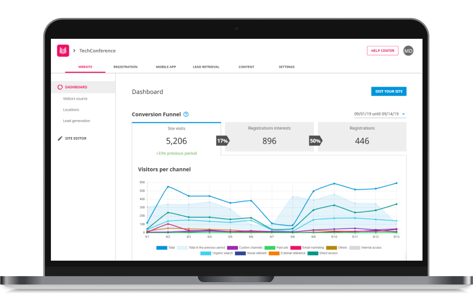
The first step in the product use was to create the event landing page and publish it. With the page live, organizers could then track all their visits, analyze what are the most common visitors’ source and their conversion to ticket sales. By keeping up with these numbers every week and defining goals, they could make tweaks to the page and their campaigns to improve conversion while releasing new event content.
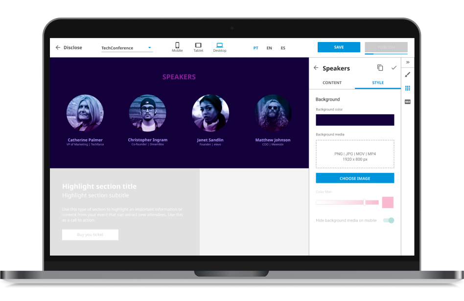
Interface of the event website builder
Website builder
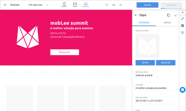
The page would be built from a pre-defined template with the most common content sections for the type of event created and with clear call-to-action buttons. For orientation and a quicker setup, basic event information such as the event name, date, and venue were already filled in appropriate areas. The organizer would be able to customize text, colors, images, and media, add new sections and rearrange them.
Website layout in desktop and mobile versions
Responsive page
Even though a big portion of the event websites’ access was from mobile devices, the mobile version of these sites was often overlooked. Our layout was made to be responsive and while building the page, the user could preview how the page would look on a desktop, tablet, or even a smartphone. To optimize the page loading time, there were also options for hiding some types of media on the mobile version.
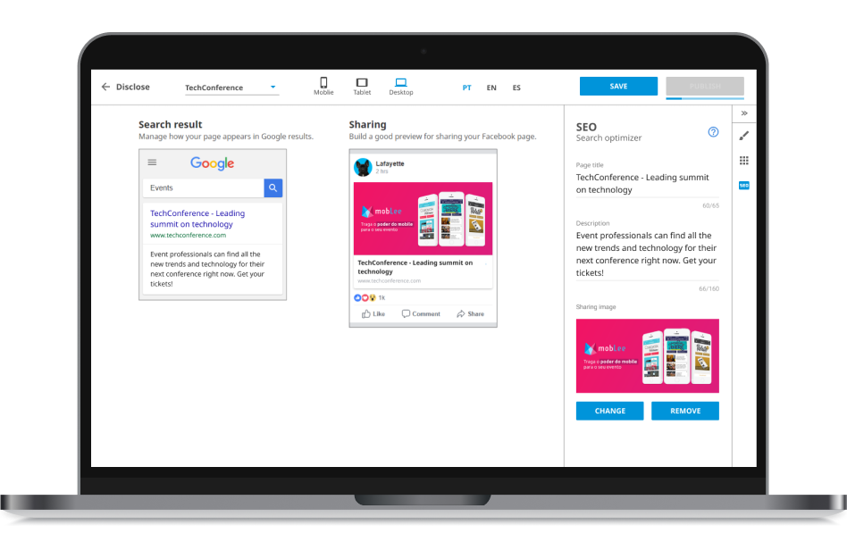
SEO settings section of the website builder
SEO structure
The page structure was compliant with Search Engine Optimization best practices and our Customer Success team was trained to provide orientation on how to improve the use of keywords throughout the page. Small teams had little experience in preparing their website for Google’s search ranking and this was important to help them improve their organic reach.
The final product dashboard with the conversion funnel
Conversion funnel
The product tracked every visit to the website and every click in a registration button and, with integration or manual input, it could also track the final registration numbers, calculating the conversion rate between these 3 steps. Based on these metrics, organizers could plan efforts to improve their results. They would be able to highlight content to motivate visitors to buy tickets or make promotions to capture those giving up in the registration phase, for example.
Interface of the launch version of the Visitors report
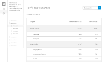
Acquisition channels
Using referrers and UTM parameters in the URL, the product would keep track of metrics for individual acquisition channels: email, social network, ads, external referrals, organic search, direct access. Each channel was broken down into campaigns or referrer, making it possible for organizers to measure the results of each campaign and their return over investment.

Testing and final validation

In the testing round with customers, we learned that many of them had little to no knowledge about campaign management through UTM parameters. This was essential to accurately track each acquisition channel and I prepared a lot of materials for our help center. In our training sessions with the Customer Success team, we stressed the importance of reinforcing marketing link best practices.

In one of our tests, I was showing the final prototype, and interviewing the client, but our CEO was also present in the call. This event had just finished that year edition and was about to start preparing for the next one. The reception was excellent and it was our first closed deal, still based on the prototype since the product was not fully developed yet.

Preparing the launch

This release would be a big change for our whole customer base. The visual would be different, but also the features would be moved and reorganized. What was concentrated in one place now would be separated into different areas. To prepare our clients for it, I worked with the Customer Succes team to create a series of emails and communication efforts to build awareness around the changes that would occur.

One of the final steps was to change the legacy part of our platform to match the new branding developed during this period. The new product was built using newer technology and was a separate project. To help with it, I also remade the whole CSS from the event app and lead retrieval management areas of the platform.

Learnings and iterations

We soon realized we had oversimplified the acquisition channels report. For organizers that were not used to analyzing this kind of data, it was a whole new world of discovery and enchantment. On the other hand, more experienced event marketing teams already had particular ways of dealing with campaigns and often times would use very specific utm parameters that our system could not recognize. We then reworked the report to better group channels and create new mediums based on the custom parameters the event teams set up.
Change to the visitors report interface
The new version of the report considers custom parameters and is more detailed
Our changes to the platform navigation had a secondary objective of raising awareness in our customer base that the company had other products besides the known event app. We first used the name of the products in the interface, and that proved to be confusing, especially because the names were in English and did not fit our Latin American users. We later changed the product labels in the navigation to more straight forward labels that described each product.

Selling the solution to our current customers was challenging because of timing. The event app was usually hired 2 to 4 months before the event. At that time, all the promotion efforts were already ongoing, so we needed to wait for the next event cycle.

Customers requested constantly the ability to add other tools to the website, like the Facebook Pixel and Chat solutions. We decided to integrate it with Google Tag Manager, openning the range of tools that could be used in the website without a big development effort.

Personal challenges and outcomes

This was my first time facilitating a whole design sprint process, and not just some activities, so it was very challenging but also rewarding. The whole company was integrated into the process of this new product. Our regular Design reviews, that I conducted every 2 weeks were always full of people wanting to know about the project progress. 

Customers were surprised by the new concepts they were discovering while using the new product. It served as a learning tool for some of them to understand better how Google’s SEO works and how to manage campaigns in different media.